Equality vs Equity
Oli Williams
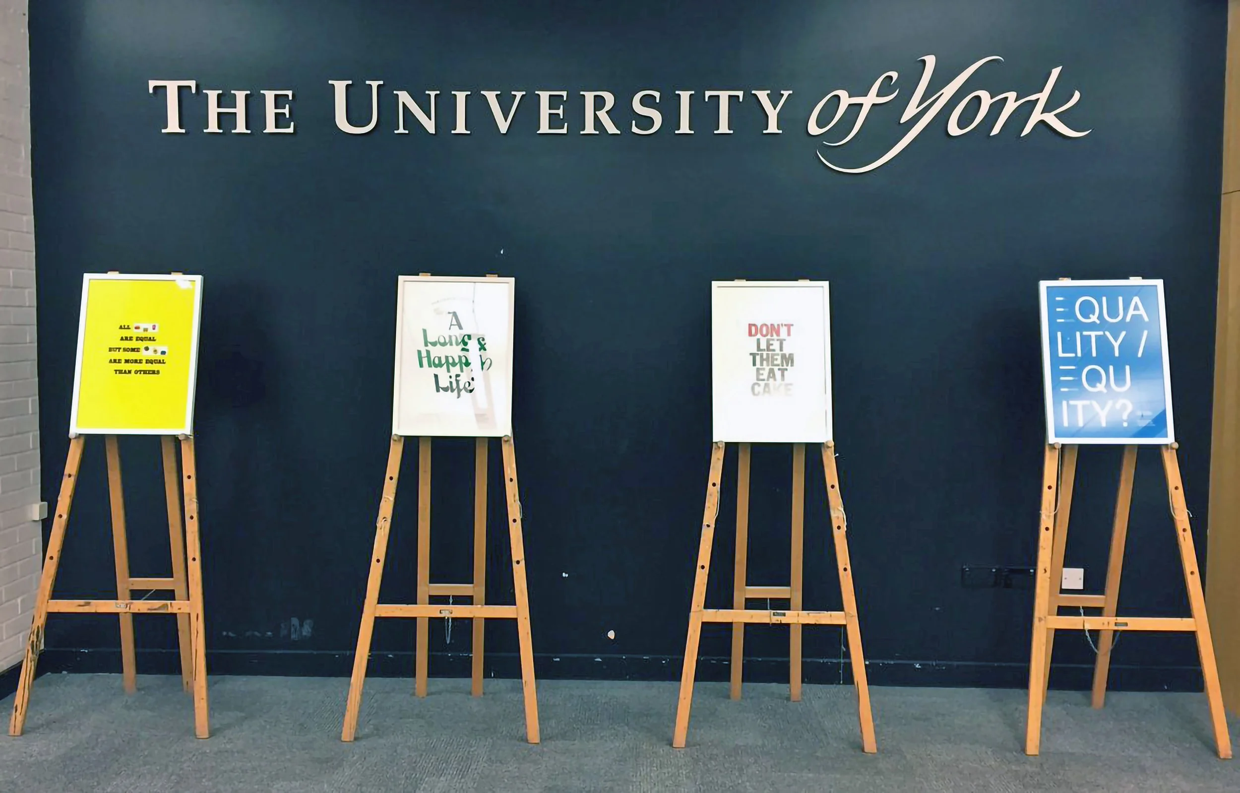
As part of a thesis brief by Oli Williams at the University of Bath, the project explored themes of health equity and wider social issues. The task was to create a poster that visually communicated one of the thesis topics in a way that was conceptually strong and immediately understandable.
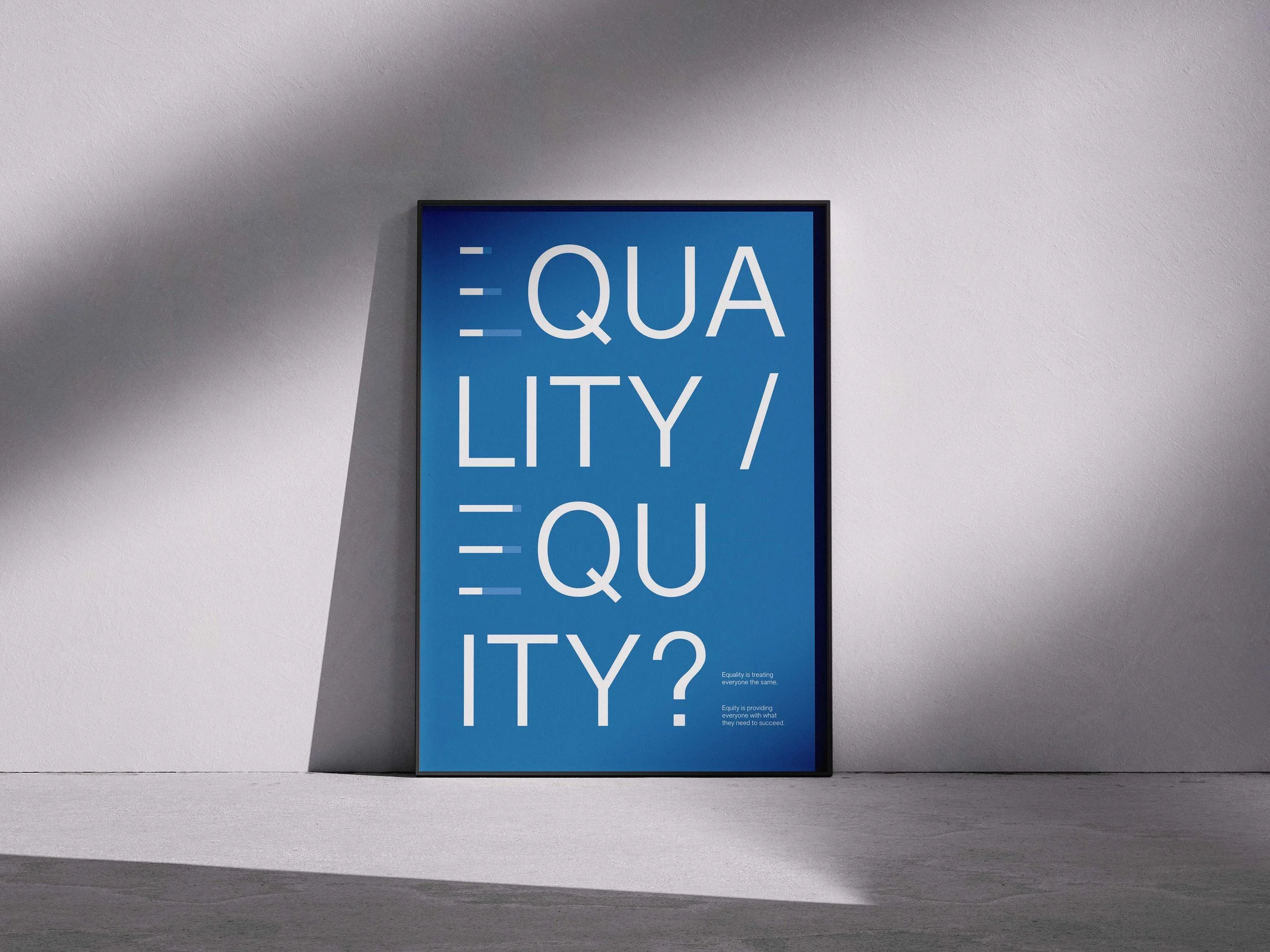
I chose to focus on Equality vs Equity, a nuanced concept that required clarity, restraint, and visual precision to be effective.
My Approach
I designed a minimalist typographic poster, using three simple lines to construct the letter “E” in both Equality and Equity. Subtle shifts in spacing and alignment were used to differentiate the two terms, allowing the concept to be communicated visually rather than explained through text.
The reduction of form helped engage viewers quickly, encouraging interpretation while clearly conveying the underlying message. The final work was selected for the Equity Is The Answer exhibition at the University of Bath.